An Overwhelming Web: How Many Call-to-Action Buttons Are Too Many
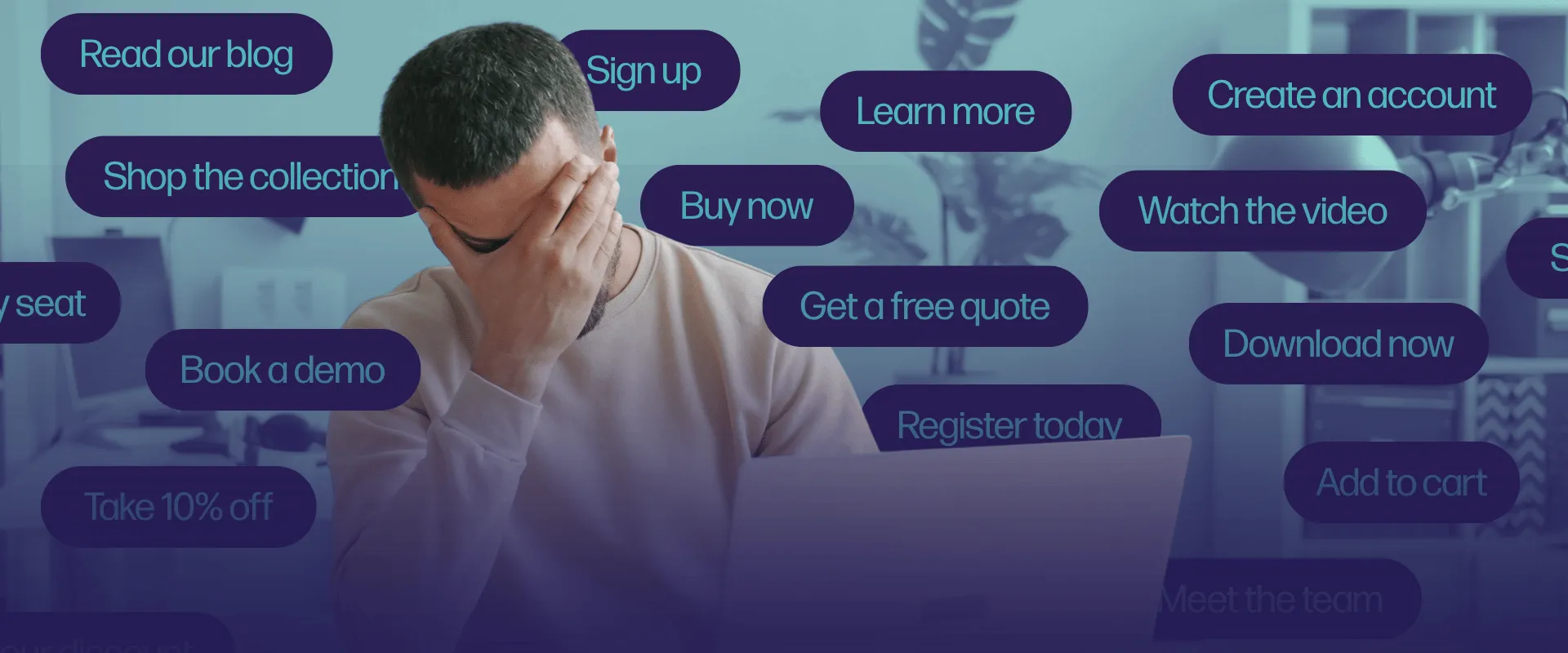
Here’s the scenario. You've done the hard part. You built a beautiful website, wrote copy that doesn't put anyone to sleep and hired someone (us?) to make sure everything works together seamlessly to generate conversions. Then, in a fit of confidence, you add a new call-to-action button, or CTA. Then another. And another.
"Shop Now." "Learn More." "Get a Quote." "Sign Up." "Talk to an Expert."
By the time visitors scroll to the footer, you've asked them to make five different decisions, which has led to them making zero. That's the CTA paradox: More buttons don't necessarily mean more conversions. They often mean more hesitation.
Why more choices lead to less action
There's actual science behind this, not just our 18-year-old marketing agency’s intuition. Psychologists William Hick and Ray Hyman found that the time it takes a person to make a decision increases with the number of options in front of them, a principle now known as Hick's Law. Every extra button on your homepage is a small tax on a visitor's attention, and most people won't pay it.
Researchers call the bigger version of this problem overchoice, or choice overload: the point at which more options stop feeling like freedom and start feeling like friction. It's the same reason a grocery aisle with 30 kinds of jam sells less jam than one selling only six. Give a customer too many places to click and the easiest choice becomes clicking nowhere at all.
So how many CTAs is "too many"?
There's no magic number, but there is a great question: What's the one thing I want this visitor to do? If you can't answer that in a sentence, you’ve burdened your landing page with too many jobs. As a general rule of thumb:
- One primary CTA per page, stated clearly and probably twice
- One secondary CTA at most, for visitors who aren't ready to commit
- Zero competing CTAs, particularly above the fold
For our consumer packaged goods (CPG) and food-and-beverage (F&B) clients, that primary CTA is usually "Buy Now" or "Find a Retailer." For law firms, it's "Schedule a Consultation." For kids-and-toys brands, it might be "Find in Stores" paired with a softer "Join Our List." Tech clients in particular get tempted to bog down their homepage with "Book a Demo," "Start a Free Trial" and "See Pricing" all at once.
The solution is fewer, smarter choices
You don't need to strip your website of every secondary link. Navigation, footers and product pages can carry more options because visitors expect to browse there. The homepage and landing pages are where restraint counts, because that's where first impressions, and first conversions, happen.
Repeating the same CTA also isn't clutter. "Shop Now" at the top and bottom of a long page is one decision asked twice, not two decisions. Five different CTAs asking for five different actions is where the wheels come off.
Let's elevate that
If your site currently reads like a choose-your-own-adventure novel, we can do the research to find out which buttons actually convert. Let's talk about your CTAs and everything else standing between your visitors and a "yes."
Written in collaboration with Claude