
5 Easy Ways to Improve Your Website's Accessibility
“Accessibility" can sound like one more chore on a to-do list that's already running off of the page. You're running a business, building a brand and trying to keep up with everything else; who has time to audit your website line by line?
Actually, we do! 🙋 Compliance is a critical component of web design and development, and with a lawyer as our CEO, we take it seriously.
And here’s the even better news: you don't need a top-shelf developer on retainer or a six-figure budget to make real progress. A few smart, low-lift changes can measurably improve the user experience (UX) for the roughly 1 in 4 U.S. adults who live with a disability. For small and medium-sized businesses in competitive spaces like CPG, tech, law, food and beverage, and kids and toys, that's not a "nice to have." That's a lot of customers you might currently be locking out.
Your Website Accessibility Checklist
Are small businesses likely to receive a demand letter in the mail or get hit with a private lawsuit? The chances are slim, but never zero. (If it can happen to Beyoncé, it can happen to anyone!) Site accessibility should really be baked into the development process. However, if you can’t afford to hire a web team right now and you’re retrofitting your accessibility post-build, you should definitely focus on these five basics:
1. Write real alt text for your images
Alt text is the short description in the meta data of an image that screen readers use to announce to people who are blind or have low vision. If you're relying on your website builder's auto-generated "IMG_4529.jpg," you're not doing your customers (or your SEO) any favors.
The W3C's Web Accessibility Initiative recommends describing what's actually important about the image in context, not just what's technically in the frame. A product photo for a plush toy brand doesn't need "toy on white background." It needs "Squishy purple axolotl plush, 12 inches, soft to the touch." Specific, useful, done.
Decorative images (think: background flourishes) can skip alt text entirely with an empty alt="" attribute so screen readers know to breeze right past them. Just be sure that the photo truly is not important to the context or usability. If there are any questions, write the damn alt text.
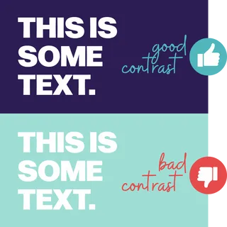
2. Fix your color contrast
If your gorgeous blush-and-cream color palette makes your body text nearly disappear into the background, it's not just an aesthetic risk; it's an accessibility one. Low contrast between text and its background is one of the most common barriers on the web, and it affects far more people than you'd think, including anyone with low vision, color blindness or, frankly, anyone squinting at a phone in direct sunlight.
The Web Content Accessibility Guidelines call for a contrast ratio of at least 4.5:1 for normal text and 3:1 for large text and graphical elements like buttons. You don't have to do the math yourself; WebAIM's free Contrast Checker will tell you if you pass or fail in seconds, plus give you a slider to nudge your colors into compliance without losing your brand's vibe.
3. Make your site totally navigable by keyboard
Not everyone uses a mouse or trackpad. Some people with motor disabilities navigate entirely by keyboard, tabbing from link to link, button to button. Try it yourself: unplug the mouse and see if you can get through your homepage, add something to a cart or fill out a contact form using only the Tab, Enter and arrow keys.
If you get stuck, lost or land on an invisible focus state, you've found a barrier. This matters just as much for a law firm's intake form as it does for a food and beverage brand's online ordering flow. If someone can't complete the transaction without a mouse or trackpad, you've lost the sale. And, maybe a lawsuit.
4. Use headings the way they're meant to be used
Headings represent more than a font-size decision; they represent a visible sitemap. Screen reader users often jump from heading to heading to scan a page the way sighted users skim with their eyes, so a logical structure (i.e., one H1, followed by H2s for main sections and H3s for subsections) actually determines whether someone can find what they need.
Skipping straight from an H1 to an H4 because it "looked right" breaks that map. The fix costs nothing: just use your website platform's built-in heading styles in order, instead of manually bolding and enlarging text to fake the look of a header.
Note: it’s much easier to build this content architecture into the site in the development stage than it is to update it later. That’s why we recommend hiring marketing agencies to build your site rather than a standalone developer.
![Parks and Recreation episode screenshot with "[laughs]" in the caption but no laughing characters](/uploads/storyBlocks/thumbnails/EMB_Website_Blog_251_Image1_320x0.webp)
5. Add captions and transcripts to video and audio
If you're using video for product demos, founder stories or the fun behind-the-scenes content your audience loves, captions make it usable for people who are deaf or hard of hearing (HOH). Plus, it’s useful for the growing number of people who scroll with the sound off. A transcript underneath does double duty, helping search engines understand and index your content, too.
Most social platforms and video hosts now offer auto-captioning as a starting point. Read them over for accuracy before you publish; auto-caption tools still stumble on brand names, industry jargon and anyone with an accent the algorithm hasn't learned yet.
Elevate My Brand’s Takeaway
None of this requires a massive overhaul. Pick one item from this list, fix it this week, and move to the next. The Department of Justice's guidance on web accessibility makes clear that accessible design is an ongoing expectation for any business serving the public online. Building it into your habits now means your brand grows up accessible, instead of needing an expensive redesign later.
Your customers with disabilities aren't a niche. They're a quarter of the population, and they deserve a website that works as well for them as it does for everyone else.
Written in collaboration with Claude